

Table of Contents
Introduction
In this blog, we’ll explore Power BI Reports vs Dashboards, understand their unique use cases, and guide you on when to use each. Finally, you’ll have the clarity you need to maximize your reporting strategy and enhance decision-making across your business.
Microsoft Power BI is a powerful suite of tools designed to transform disconnected data into cohesive, interactive, and visually compelling insights. Its ability to integrate with various Microsoft services and data sources—from webpages and PDFs to spreadsheets and SharePoint—has solidified its place as one of the most popular data visualization platforms. Power BI empowers teams to build tailored dashboards, offering real-time, easy-to-understand data for everyone in an organization.
However, when it comes to Power BI Reports vs Dashboards, many users mistakenly view them as interchangeable, particularly those transitioning from an Excel background. This confusion is understandable—after all, Excel often merges data, charts, and KPIs onto a single page, making it easy to assume the same applies to Power BI. But in reality, reports and dashboards in Power BI serve entirely different purposes. Understanding these distinctions is vital to unlocking the full potential of Power BI, whether you’re diving into in-depth data analysis or monitoring high-level performance metrics.
What is a Power BI Report?
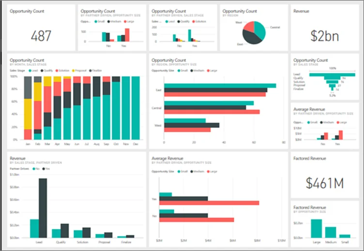
A Power BI report is a multi-perspective view of a dataset featuring a collection of visualizations that represent different findings and insights. These reports can range from a single visual to multiple pages full of visuals, providing a comprehensive and detailed analysis of your data. Each visual within a report is interconnected, allowing for interactive data exploration and analysis.
Reports are typically created using Power BI Desktop, where designers connect to various data sources, transform and model the data, and craft visuals to represent the data’s story. Once designed, these reports can be published to the Power BI service or Power BI Report Server for sharing and collaboration within an organization.
Use Cases and Benefits of Power BI Reports:
- In-Depth Data Analysis: Power BI reports are ideal for users who need to delve deep into their data, examining various dimensions and measures to uncover trends, patterns, and insights.
- Operational Reporting: Organizations can utilize Power BI reports to monitor daily operations, track key performance indicators (KPIs), and ensure that business processes are running smoothly.
- Financial Reporting: Finance departments can create detailed financial statements, balance sheets, and profit and loss reports, enabling thorough financial analysis and decision-making.
- Sales and Marketing Analysis: Sales teams can analyze performance metrics, pipeline data, and customer demographics, while marketing teams can assess campaign effectiveness and market trends.

What is a Power BI Dashboard?
Use Cases and Benefits of Power BI Dashboard:
- Executive Summaries: Dashboards offer a high-level overview of critical metrics, enabling executives to monitor the organization’s health and performance at a glance.
- Real-Time Monitoring: With the capability to display real-time data, dashboards are ideal for tracking live metrics such as sales performance, website traffic, or system operations, allowing for swift decision-making.
- Departmental Overviews: Departments can utilize dashboards to keep track of their specific KPIs, ensuring alignment with organizational goals and facilitating quick identification of areas needing attention.
- Project Tracking: Teams can monitor project progress, deadlines, and resource allocation through dashboards, ensuring projects remain on schedule and within scope.
Compare top data visualization tools: Power BI vs. Tableau- Which Data Visualization Tool is Right?
Key Differences: Power BI Reports vs Dashboards
While Power BI dashboards and reports are both integral components of the Power BI ecosystem, they serve distinct purposes and offer different functionalities. Understanding these differences is crucial for effectively leveraging Power BI to meet your organization’s data visualization and analysis needs.
1. Structure and Composition:
- Dashboards: A single page, often called a canvas, provides a consolidated view of key metrics and insights. Each visualization on a dashboard, known as a tile, is typically pinned from one or more reports and datasets. This design allows dashboards to present a high-level overview, combining data from various sources into one unified view.
- Reports: Contrastingly, a report can consist of one or more pages, each filled with multiple visualizations. Reports are usually based on a single dataset and provide a more detailed and comprehensive analysis of that data. They allow users to explore data through various interactive features like filtering, slicing, and drilling down into specifics.
2. Data Interaction and Exploration:
- Dashboards: Dashboards offer limited interactive capabilities. While users can interact with certain tiles, the primary function of a dashboard is to provide a snapshot of key metrics. Drill-down features are only available if a report page is pinned to the dashboard. Additionally, dashboards do not support filtering or slicing directly; users can set up alerts for specific tiles to monitor critical metrics.
- Reports: Reports are designed for in-depth data exploration. They offer extensive interactive features, including the ability to filter data, apply slicers, and drill down into detailed views. This interactivity enables users to analyze data from various perspectives and gain deeper insights into specific areas of interest.
3. Data Sources and Integration:
- Dashboards: A significant advantage of dashboards is their ability to aggregate visualizations from multiple reports and datasets, providing a holistic view of key performance indicators across different business areas. This capability allows users to monitor various metrics in one place, even if the data originates from diverse sources.
- Reports: Reports are generally based on a single dataset, offering a detailed examination of that specific data source. This focus allows for comprehensive analysis within the context of the dataset, facilitating a deeper understanding of the data’s nuances and underlying patterns.
4. Creation and Accessibility:
- Dashboards: Dashboards are created and accessed within the Power BI service and unavailable in the Power BI Desktop. They are designed for quick, at-a-glance monitoring and are particularly useful for executives and managers who need to keep track of key metrics without delving into detailed analyses.
- Reports: Reports are typically created using Power BI Desktop, where users can connect to various data sources, model the data, and design comprehensive visualizations. Once published to the Power BI service, these reports can be shared and accessed by others within the organization, facilitating collaboration and informed decision-making.
While both dashboards and reports are essential tools within Power BI, they cater to different needs: dashboards provide a high-level overview of key metrics from multiple sources, ideal for monitoring and quick insights, whereas reports offer detailed, interactive analyses of specific datasets, suitable for in-depth data exploration and reporting.
Let’s Build your Ideal Power BI Solution!
Every business has unique data needs. The question isn’t just Power BI reports vs dashboards—it’s about how you can use them strategically to gain a competitive edge. Are you making the most of Power BI? Get a custom Power BI consultation and demo where we’ll show you how to turn raw data into actionable insights that drive growth.
Request a DemoWhen to Use Power BI Reports vs. Dashboards
Imagine this: you’re a business analyst tasked with presenting quarterly sales performance to stakeholders. Do you create an interactive multi-page report or a high-level, single-page dashboard?
Understanding the appropriate scenarios for utilizing Power BI dashboards vs reports is essential for effective data visualization and decision-making. Each serves distinct purposes and is best suited for specific analytical needs.
Scenarios for Using Power BI Dashboards:
- High-Level Monitoring: Dashboards are ideal for executives and managers who need a consolidated view of key performance indicators (KPIs) across various departments. By aggregating visuals from multiple reports and datasets, dashboards provide a snapshot of organizational health, enabling quick assessments and timely decisions.
- Real-Time Data Tracking: Dashboards excel at displaying real-time data for scenarios requiring immediate insights, such as monitoring live sales data, website traffic, or system performance metrics. This capability allows teams to respond promptly to emerging trends or issues.
- Cross-Functional Insights: When data from different sources or departments are needed to combine data into a single view, dashboards offer the flexibility to present a unified perspective. This is particularly useful for organizations aiming to break down data silos and foster collaborative analysis.
Scenarios for Using Power BI Reports:
- Detailed Data Analysis: Reports are suited for in-depth analysis, allowing users to explore data across multiple pages with various visualizations. Analysts can delve into specifics, apply filters, and perform drill-downs to uncover underlying patterns and insights.
- Operational Reporting: For departments like finance, operations, or human resources that require comprehensive reports detailing transactions, performance metrics, or compliance data, Power BI reports provide the necessary structure and detail. They support complex data models and can present granular information effectively.
- Historical Data Analysis: Reports offer tools to visualize and interpret historical data, such as monthly sales performance, customer behavior patterns, or production metrics, when analyzing trends over time. Features like time-series analysis and trend lines help understand past performance and forecast future outcomes.
The choice between Power BI reports vs. dashboards hinges on the depth and immediacy of the insights required. Dashboards provide a high-level, real-time overview suitable for quick monitoring and cross-functional insights.
At the same time, reports offer detailed, structured analysis ideal for in-depth data exploration and operational reporting. Aligning your tool selection with your specific business needs ensures that you leverage Power BI’s capabilities to their fullest potential.
If you want consulting expertise in Power BI implementations, continue reading The Value of Consulting Expertise in Power BI Implementations.
Conclusion
Effectively utilizing Power BI reports and dashboards can transform how your organization interprets and acts on data. Recognizing when and how to use each tool is just the beginning. AlphaBOLD’s Power BI Consulting Services provide the expertise needed to tailor these tools to your unique requirements. Our team ensures that your data visualization aligns with your strategic objectives, enabling you to make informed decisions confidently. Partner with AlphaBOLD to elevate your data analytics capabilities and achieve your business goals.
Struggling with Power BI Reports vs Dashboards? We’ve Got you Covered!
Are you unsure which one fits your needs best? Do you need expert guidance on creating customized dashboards and reports that drive meaningful business decisions? Don’t let complex data hold you back! Get a personalized Power BI demo and discover how we can optimize your reporting and visualization strategy.
Request a DemoExplore Recent Blog Posts