

This blog is a guide for Data Scientists, Consultants, and BI Developers who want to carry out analysis and generate custom visuals in Power BI using Python.
Why Do We Need Visualization?
Data visualization helps us identify patterns, trends, and correlations that might not be detected otherwise. By placing the data in a visual context, we enhance our understanding of the data. Visualizations offer an effective way to convey information to the end-user. In this age of big data analysis, where we are drowning by data volume, it is nearly impossible to tell stories without using visualizations.
In this blog, I will be using Seaborn and Matlpotlib libraries in Python to create meaningful and engaging visualizations for data representation.
How To Add Custom Built Visuals in Power BI Dashboard?
Python offers the developer an option to add customized, scenario-based attractive visuals with just a few lines of codes in their dashboards. With Python at our disposal now, the visualization toolkit is enhanced, which was previously limited to inbuilt visuals provided by Power BI.
If you have any question or queries, do not hesitate to reach out to us!
1) Download Python
Before running Python scripts in Power BI desktop, you need to install Python on your local machine. This is because Power BI desktop does not include, deploy, or install the Python engine. Therefore, you need to go to the Python Download page and download the installer based on the OS version.
After the Python installer has downloaded, click on the installer file to launch.
Install Required Python Packages
For this blog, we need the following Python packages to be installed:
- Pandas
- Matplotlib
- Seaborn
- Numpy
Matplotlib: This is Python’s 2D plotting library that produces quality figures. Using this library, it makes it easier to generate plots, histograms, power spectra, bar charts, scatterplots with few lines of codes.
Seaborn: This is a data visualization library based on matplotlib package. For more attractive and informative statistical graphics, this library is used.
Pandas: A library for data manipulation and analysis. It provides powerful and flexible data structures that make data wrangling an easy task. DataFrame is one of the essential components of these structures.
Install the above packages by executing the below command on Command Line tool:
- pip install pandas
- pip install matplotlib
- pip install seaborn
2) Creating Visualization With Python In Power BI Desktop
To get started with the visualization in Power BI with Python, load a sample dataset into Power BI.
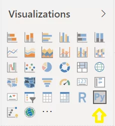
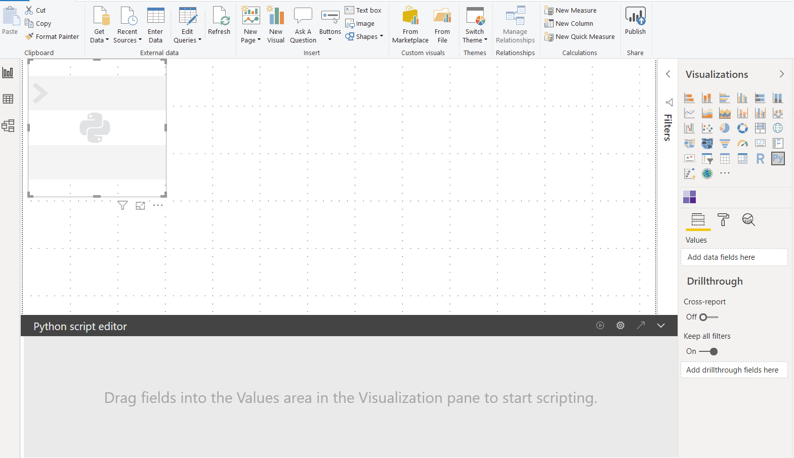
- Click on the Python visual within the visualization panel, as shown in the image.

- A Python image place holder appears in the canvas in Power BI. We also see a “Python script editor” at the bottom of the page.

- Next, load a dataset of your choice into Python.

Load Test
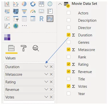
- Drag and drop the attributes/fields to be visualized for analysis using Python in the Values section, as shown in the image. The fields that are added to the Values section shall be available for your Python scripts.

- Now the data can be used to create plots using Python script. A Python code gets generated for the selected fields.

- Write the Python code in the script editor to build visualization and click the “play” button to execute.
- Find below some attached visuals.
- Create a Heatmap Correlation plot

A Heatmap Correlation plot is a way of representing data in which values are colored. The color communicates a value to the viewer. This visual is helpful when you are dealing with a large amount of data, and you want to identify correlation among the columns.
This heatmap in the above picture shows the data of movies based on user votes. The movies which get more votes by users earn more revenue. Therefore, we can establish that there is a high correlation between the Votes and Revenue.
-
- Violin Plot
The Violin Plot is the best tool to visualize the distribution of data probability density. This chart is a combination of a box plot and a density plot that shows data distribution.
This visual above shows the maximum, minimum, and average movie ratings from 2010 to 2020. For instance, in the year 2016, most of the movies were rated more than 5 and less than 8. Some movies achieved a rating close to 9.
-
- Countplot
It is a histogram across a categorical, instead of quantitative values. A more fancy way of drawing barplot() with just a few lines of code and data understanding.
This visual shows the count of movies of the span of years.
- Lastly, you can display the visuals as per your choice in the Power BI report, as shown in the following image.
Known Limitations
Python visual is an excellent feature to use with Power BI, but it has few limitations:
- A dataset of maximum 150,000 rows can be used for the Python plot. Not more than this.
- We cannot prepare an interactive image with it.
- Python script will give a timeout error after 5 minutes of execution
- Python plots cannot be used for cross-filtering.
- The following Python packages (non-Intel MKL) are currently supported:
- Matplotlib
- Numpy
- Pandas
- Scikit-learn
- Scipy
- Seaborn
- Statsmodel
There you go! I hope that this blog has brought clarity to all data scientists, consultants, and BI developers and helped them in their endeavors to carry out analysis and generate custom visuals in Power BI using Python. If you have any questions or insights on the blog, please leave a comment below.