Traditional dashboards often present static data views, limiting user interaction and exploration. Interactive Experience dashboards in Dynamics 365 address this limitation by offering dynamic filtering, multi-stream visualizations, and an enhanced user interface. This blog post provides a technical analysis of these features, demonstrating how they empower users to gain more actionable insights from their data.
Interactive Experience Dashboards in Dynamics 365 CE: Overview
Let’s provide some context for Interactive Experience dashboards in Dynamics 365. These dashboards were initially introduced as part of the Interactive Service Hub, a focused workspace designed to empower customer service professionals. The core concept behind Interactive Experience dashboards was to provide a more dynamic and user-friendly way for service teams to visualize and interact with key data related to customer cases, queues, and performance metrics. They were designed to move beyond static dashboards and offer real-time insights, enabling service agents and managers to proactively address customer issues, monitor team performance, and identify trends.
Interactive Experience Dashboards vs. Traditional Dashboards:
Traditional dashboards in Dynamics 365 provide a foundational overview of key performance indicators and data visualizations, often presenting static information from a single entity. Interaction is typically limited to viewing the presented data. In contrast, Interactive Experience dashboards significantly enhance user engagement and analytical capabilities. They introduce dynamic filtering options, including visual filters within multi-stream dashboards, and global filters that apply across all dashboard components. This allows users to explore data more deeply and gain insights from multiple perspectives.
Furthermore, Interactive Experience dashboards offer multi-stream functionality, enabling the visualization of data from related entities simultaneously. This eliminates the need to navigate between multiple dashboards for a holistic view. Features like tile view in multi-stream dashboards provide a compact overview of data streams, enhancing efficiency. Ultimately, Interactive Experience dashboards empower users with more interactive and dynamic data exploration, moving beyond static presentations to facilitate deeper analysis and more informed decision-making.
Top Interactive Experience Dashboards in Dynamics 365 CE
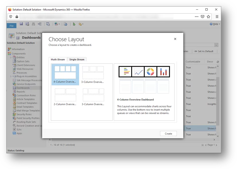
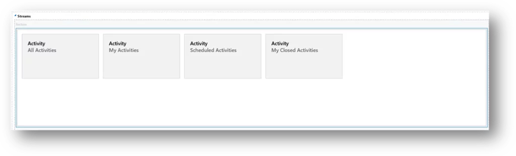
Multi-Streams Dashboards
In Multi-stream, you can add multiple streams to this type of dashboard. When you add a stream, you must select the name of the entity you want to see in each stream. Users can use every unified interface-supported entity for this purpose. When you choose an entity, you must also choose a view used in the stream to display the data in Dynamics 365 interactive dashboards.
Ready to leverage Dynamics 365 Interactive Dashboards for unparalleled customer insights? Join forces with AlphaBOLD to explore cutting-edge solutions that enhance customer satisfaction and drive sales.
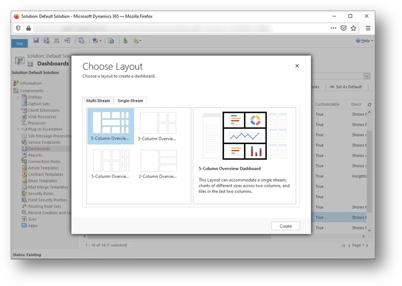
When you add a stream dashboard, you cannot pick which entity. This will be set at the dashboard level. You also cannot use a queue in the stream. You can only add a single entity to this dashboard.
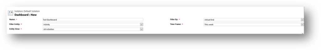
Once you pick the stream, you can add other components to the dashboard. Let’s look at the required fields on the dashboards. Both multi-stream and single-stream dashboards contain these fields:
Name: This is the name of the dashboard.
Filter Entity: Pick the entity showing the data on the dashboard. All the data in the dashboard’s charts, views, and filters are based on this entity.
Time Frame: This is the time frame of the data. Users can select a different timeframe.
Filter By: This field would determine the filter criteria for displaying the records. In this example, we choose the “Actual End” field of the Activity entity. This means that if the actual end date falls in the “Time Frame,” then the records will be displayed.
New Features of Interactive Experience Dashboard in Dynamics 365
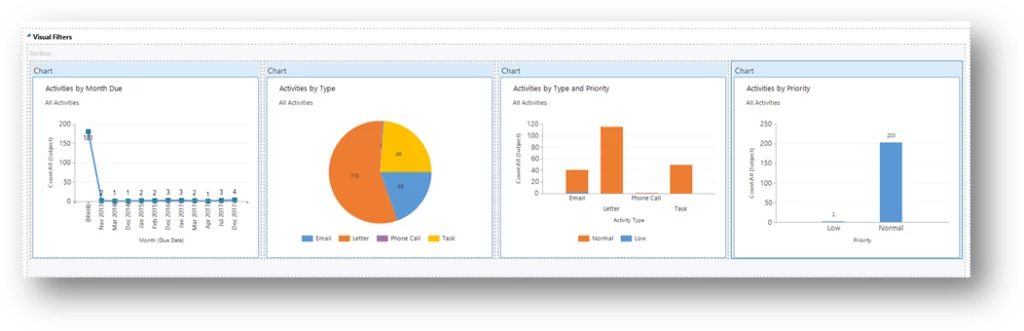
Visual Filters:
Another main difference between multi-stream and single-stream dashboards is that multi-stream has visual filters. These are the charts on the dashboard. When users open the multi-stream dashboard, they will see the ‘show visual filter’ button on the command bar, which they can use to show or hide the dashboard charts. Users can filter the data by clicking any of the charts.
Transform Customer Interactions with Dynamics 365!
Eager to elevate your customer service through the power of Dynamics 365? Begin your transformative journey with AlphaBOLD, and let's unlock the full capabilities of interactive dashboards and analytics.
Multi-stream dashboards also have a tile view that allows them to change all the dashboard streams to a tile view. These tiles behave the same way. Users can toggle between stream and tile views using the command bar’s ‘switch to tile view’ button.
Global Filters:
The dashboard’s command bar has a ‘show global filter‘ button. This allows users to filter the data. Data in charts can be filtered by using global filters. Also, streams and tiles based on the entity selected in the dashboard will be filtered.
You can enable or disable fields for use in the global filter. You can do this in the field’s properties advanced options section, where you will have checkboxes to allow the field to appear in the global filter.
Dynamics 365 dashboards are continually evolving, reflecting advancements in data visualization and user experience. Recent trends emphasize increased interactivity, with features like drill-through capabilities and enhanced filtering options becoming more prevalent. Dashboards are also becoming more context-aware, integrating data from various sources and providing personalized insights based on user roles and preferences. Furthermore, there’s a growing emphasis on accessibility, ensuring dashboards are usable by individuals with diverse needs. The integration of AI and machine learning is also beginning to shape the future of dashboards, with predictive analytics and automated insights becoming increasingly common.
Another significant trend is the move towards embedding dashboards within other applications and workflows. This allows users to access key performance indicators and visualizations directly within the context of their work, eliminating the need to switch between different systems. Mobile accessibility is also a crucial focus, with dashboards being optimized for viewing and interaction on various devices. Finally, the ability to easily customize and configure dashboards without extensive coding is becoming increasingly important, empowering users to create visualizations that meet their specific needs. These trends point towards a future where Dynamics 365 dashboards are not just static displays of data, but rather dynamic, interactive tools that empower users to make better decisions and drive business outcomes.
Conclusion
In conclusion, Dynamics 365 Interactive Experience dashboards offer a significant enhancement over traditional dashboards, providing a more dynamic and user-friendly way to visualize and interact with data. Multi-stream dashboards, with their visual filters, tile view, and global filtering capabilities, empower users to gain a holistic view of their data across multiple entities. Single-stream dashboards, while focused on a single entity, still benefit from the improved interactive experience. By understanding the nuances of these dashboard types, users can create powerful tools for monitoring performance, identifying trends, and making informed decisions. Leveraging these Dynamics 365 dashboards examples within your organization can significantly improve operational efficiency and provide valuable insights. Whether you’re exploring Dynamics 365 dashboard examples for sales, service, or marketing, the interactive experience offers a powerful way to visualize and act on your data. Remember, effective use of Dynamics 365 dashboards requires careful planning and configuration to ensure they meet your specific needs and provide actionable insights.