

Introduction
This article aims to provide a comprehensive comparison of Power BI Vs. Tableau, focusing on how each tool handles data visualization, performance, interactivity, and data modeling. By the end of this article, you will have a clearer understanding of which tool aligns best with your organization’s needs and goals.
Imagine you’re in a meeting, presenting last quarter’s sales data to your team. The ability to turn complex data into clear, actionable insights can make all the difference. In fact, a study by university of Idaho found that 70% of organizations consider data visualization vital for understanding and acting on business data. Microsoft Power BI and Tableau are two top contenders in this space, each offering robust tools for data transformation and visualization.
For managers, the choice between Power BI and Tableau can significantly impact how effectively data is communicated across the organization. Choosing the right data visualization tool can be a daunting task, particularly when considering the type of data sources, you work with and whether those data sources require extensive Extract, Transform, Load (ETL) processes.
Understanding the Basics of Power BI Vs. Tableau
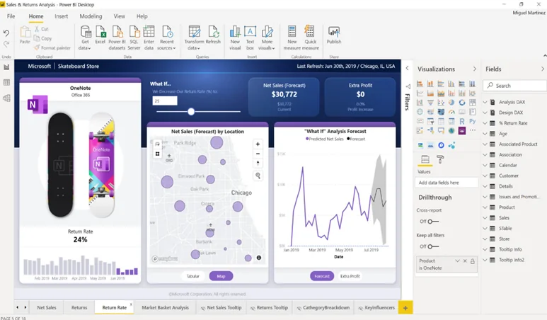
Power BI Overview
Integration with Microsoft Ecosystem:
Pricing and Accessibility:
Key Features and Capabilities:
Power BI offers a range of features that cater to both beginners and advanced users. Key features include:
- Data Visualization: A wide variety of built-in and custom visualizations.
- Data Modeling: Integration with Power Query for robust data transformation and modeling.
- Collaboration: Sharing and collaboration features within Microsoft Teams and SharePoint.
- Real-time Data: Support for real-time data streaming and dashboard updates.
- AI and Machine Learning: Built-in AI capabilities for advanced analytics.
Ready to see How Power BI Can Transform Your Data into Actionable Insights?
Request a personalized demo today and discover how seamless integration with Microsoft 365, cost-effective solutions, and powerful data modeling can benefit your organization.
Request a DemoTableau Overview
Focus on Visualization and Design:
Tableau is renowned for its superior data visualization capabilities. It emphasizes creating visually appealing and highly interactive dashboards that effectively communicate data insights. Tableau’s user-friendly interface and drag-and-drop functionality make it accessible to users with varying levels of technical expertise, focusing heavily on the aesthetics and functionality of visualizations.
Pricing and Accessibility:
Tableau’s pricing model is based on user roles, offering different licenses such as Tableau Creator, Explorer, and Viewer. While Tableau can be more expensive than Power BI, its comprehensive feature set and strong focus on visualization justify the investment for many organizations. Tableau also offers Tableau Public, a free version for creating and sharing visualizations publicly, which is useful for individual users and educational purposes.
Key Features and Capabilities:
Tableau’s strength lies in its advanced visualization and analytical capabilities. Key features include:
- Advanced Visualizations: A vast array of visualization types and customization options.
- Interactivity: Rich interactive features, including filters, drill-downs, and parameter actions.
- Data Handling: Efficient handling of large datasets with powerful in-memory data processing.
- Integration: Compatibility with numerous data sources and seamless integration with Tableau Prep for data preparation.
- Community and Resources: A vibrant community with extensive learning and support resources.
Feature Comparison Table: Power BI Vs. Tableau
You can use this table to check which features available within Power BI vs. Tableau align with your company’s data needs:
| Features | Microsoft Power BI | Tableau |
|---|---|---|
|
API |
Yes |
Yes |
|
Access Controls/Permissions |
No |
Yes |
|
Activity Dashboard |
Yes |
Yes |
|
Ad hoc Query |
Yes |
Yes |
|
Ad hoc Reporting |
Yes |
Yes |
|
Collaboration Tools |
Yes |
Yes |
|
Customizable Branding |
No |
Yes |
|
Customizable Dashboard |
Yes |
Yes |
|
Customizable Reports |
Yes |
Yes |
|
Customizable Templates |
No |
No |
|
Real-Time Analytics |
Yes |
Yes |
|
Trend Analysis |
No |
Yes |
|
Multiple Data Sources |
No |
No |
Visualization Capabilities: Power BI Vs. Tableau
Effective data visualization is at the heart of any powerful analytics tool, enabling users to transform raw data into meaningful, actionable insights. When comparing Power BI and Tableau, their visualization capabilities emerge as a key differentiator. This section delves into how each tool handles visualizations, exploring the range of standard and custom options available, the ease and flexibility of creating advanced visuals, and their performance in handling large and complex datasets.
Understanding these capabilities will provide a clearer picture of which tool can best meet your specific data visualization needs and preferences.
Power BI’s Visualization Capabilities:
Standard and Custom Visualizations:
Use of Deneb for Advanced Visuals:
Comparison of Visual Quality and Flexibility:
While Power BI offers robust visualization options, there are some limitations regarding visual quality and flexibility compared to Tableau. For instance, Power BI can struggle with displaying many data points effectively, such as millions of points on a scatterplot. Users often navigate numerous menus to find specific settings, hindering the ease of use and customization. However, with the right skills and additional tools like Deneb, Power BI can produce visualizations that rival Tableau’s.
Tableau’s Visualization Capabilities:
Advanced Visualization Capabilities Out-of-the-Box:
Tableau is widely recognized for its superior out-of-the-box visualization capabilities. It provides a comprehensive suite of advanced visualization options that are ready to use without the need for additional tools or coding. This includes complex charts, heat maps, treemaps, and more designed to facilitate insightful data exploration and presentation.
Grammar of Graphics Approach:
Handling Large Data Sets and Complex Charts Effortlessly:
One of Tableau’s standout features is its ability to handle large datasets and complex charts without performance degradation. Tableau efficiently processes and displays millions of data points, enabling users to interact with their data smoothly and without limitations. This capability is crucial for organizations dealing with extensive datasets, as it ensures that visualizations remain responsive and informative even as data complexity increases.
In summary, the bigger picture of Power BI Vs. Tableau offers a clear insight into how both these tools have visualization capabilities that cater to different needs and preferences. Power BI balances standard and custom visuals with advanced options available through tools like Deneb. Tableau excels in out-of-the-box visualization quality, ease of use with its grammar of graphics approach, and superior performance with large datasets. Understanding these differences can help you choose the tool that best fits your visualization requirements.
Unlock the Full Potential of Your Data with Power BI!
Experience firsthand the ease of use, advanced visualization capabilities, and seamless integration with your existing Microsoft tools. Request a demo now, and let us show you how Power BI can revolutionize your data analytics.
Request a DemoComparing Performance and Interactivity: Power BI Vs. Tableau
Power BI’s Performance
Interactivity Features and Limitations:
Overview of Tableau’s Performance
Performance of Table Calculations:
Advanced Interactivity through Parameter and Set Actions:
Tableau excels in providing advanced interactivity options through parameter and set actions. These features allow users to create highly interactive and dynamic dashboards that can respond to user inputs in real time. Parameter actions enable users to change values and update visualizations instantly, while set actions allow for complex data manipulation and analysis within the visual interface. These capabilities make Tableau a powerful tool for creating engaging and interactive data stories, offering a level of interactivity that is often difficult to replicate in Power BI.
In conclusion, both Power BI and Tableau offer robust performance and interactivity features but cater to different needs and user expertise. Power BI provides powerful data modeling and interactivity options, although it may require careful DAX optimization and additional effort for advanced interactions. Conversely, Tableau offers superior performance in table calculations and advanced interactivity through intuitive parameter and set actions, making it a strong choice for users seeking seamless and dynamic data exploration.
Differences in Usability and Learning Curve
Power BI:
1. Ease of Use for Beginners:
2. Integration with Microsoft 365 for Seamless Access:
A significant advantage of Power BI is its seamless integration with Microsoft 365. This integration allows users to easily access and share data across various Microsoft applications, such as Excel, SharePoint, and Teams. The familiar Microsoft environment reduces the learning curve for users already accustomed to Microsoft products, enabling them to leverage their existing skills and workflows.
3. Community and Support Resources:
Power BI benefits from a vast and active community of users and experts. This community offers a wealth of resources, including forums, blogs, webinars, and user groups, providing valuable support and insights. Additionally, Microsoft’s comprehensive documentation and support services ensure that users can find solutions to their queries and challenges, enhancing the overall usability of the platform.
Tableau:
1. Steeper Learning Curve for Advanced Users:
2. Focus on Creating High-Quality Visualizations:
Tableau primarily focuses on enabling users to create visually stunning and highly interactive dashboards. Its powerful visualization engine and design flexibility allow users to produce professional-grade visuals that can effectively communicate complex data insights. This emphasis on quality makes Tableau a preferred choice for users who prioritize their visualizations’ aesthetic and functional aspects.
3. Strong Community and Support Resources:
Like Power BI, Tableau boasts a strong and vibrant community of users and experts. The Tableau community provides extensive resources, including online forums, training videos, user conferences, and a wealth of third-party content. This community-driven support, combined with Tableau’s official documentation and customer support services, ensures that users can access the help they need to overcome challenges and advance their skills.
Support & Training Comparison: Power BI Vs. Tableau
| Support | Microsoft Power BI | Tableau |
|---|---|---|
|
Email/Help Desk |
Yes |
Yes |
|
FAQs/Forum |
Yes |
Yes |
|
Knowledge Base |
Yes |
Yes |
|
Phone Support |
Yes |
Yes |
|
24/7 (Live rep) |
Yes |
Yes |
|
Chat |
Yes |
Yes |
| Training | Microsoft Power BI | Tableau |
|---|---|---|
|
In Person |
Yes |
Yes |
|
Live Online |
Yes |
Yes |
|
Webinars |
Yes |
Yes |
|
Documentation |
Yes |
Yes |
|
Videos |
Yes |
Yes |
Curious About How Power BI Can Enhance Your Business Analytics?
Get a customized demo to explore its intuitive interface, robust data modeling, and powerful visualizations. Don't miss out on the opportunity to see Power BI in action. Request your demo now and take the first step towards data-driven success!
Request a DemoPricing & Cost Considerations
Power BI:
Cost-Effectiveness, Especially for Microsoft 365 Users:
Power BI is renowned for its cost-effectiveness, making it an attractive option for businesses of all sizes. For organizations already utilizing Microsoft 365, Power BI offers additional value by providing seamless integration at no extra cost. Power BI Desktop is free, allowing users to explore its basic functionalities without any initial investment. This makes Power BI particularly appealing for small businesses and startups looking to implement data visualization solutions without significant financial commitments.
Licensing Options and Total Cost of Ownership:
Power BI offers flexible licensing options to cater to different organizational needs. Power BI Pro is available on a per-user, per-month basis, granting access to advanced features, collaboration tools, and sharing capabilities. Power BI Premium offers a capacity-based licensing model for larger organizations, providing dedicated cloud resources and additional enterprise features. This flexibility in licensing ensures that businesses can choose a plan that aligns with their budget and usage requirements, ultimately lowering the total cost of ownership.
Tableau:
Higher Cost but with Added Value in Visualization Capabilities:
Consideration of Licensing and Subscription Models:
Tableau’s licensing model is structured around different user roles, including Tableau Creator, Explorer, and Viewer. This tiered approach allows organizations to tailor their subscription based on user needs and responsibilities. While the cost can be higher, role-based licensing ensures that users get access to the tools and features necessary for their specific tasks. Tableau also offers subscription plans, which provide flexibility and scalability as organizational needs evolve. This model allows companies to manage their expenses more effectively while benefiting from Tableau’s comprehensive visualization capabilities.
The table below serves as a comparison tool for the pricing model of these tools:
| Microsoft Power BI | Tableau |
|---|---|
|
Starting from $10/Month Pricing Model: Per User Free Trial: Yes Free Version: No |
Starting from $15/Month Pricing Model: Per User Free Trial: Yes Free Version: Yes |
Power BI Vs. Tableau for Different Business Verticals
Power BI For Retail:
For the ever-evolving retail sector, having real-time data at your fingertips is not just a luxury but a necessity. Power BI has risen as a powerful ally in this sector.
- Real-Time Sales Insights: With Power BI, retailers can monitor sales in real-time, understand peak sale hours, and evaluate performance against past data.
- Inventory Management: The tool assists retailers in maintaining optimal inventory levels, ensuring neither an excess nor a shortage.
- Customer Preferences: Power BI deepens into customer buying habits, preferences, and feedback, helping retailers tailor their offerings.
Explore how Power BI enables real-time data visualization: The Importance of Real-Time Data Visualizations in Power BI.
Tableau For Healthcare:
Healthcare, a sector where timely and accurate data can mean the difference between life and death, has found a dependable partner in Tableau.
- Patient Data Management: Tableau aids in centralizing patient records, ensuring swift and informed medical decisions.
- Treatment Efficacy: Healthcare professionals can evaluate and optimize treatment protocols by visualizing treatment outcomes.
- Operational Efficiency: Tableau ensures the healthcare machinery runs smoothly, from managing hospital beds to optimizing shift schedules.
AlphaBOLD's Power BI Services
Recognizing the unparalleled capabilities of Power BI, AlphaBOLD offers specialized Power BI services. More than just implementation, AlphaBOLD focuses on harnessing the full potential of Power BI to craft data-driven strategies that drive results. In a world where data is gold, Power BI is the alchemist, and partnering with experts like AlphaBOLD ensures you extract maximum value from your data.
Why Choose AlphaBOLD as Your Power BI Consultant?
AlphaBOLD prides itself on its rapid-response mechanism, ensuring your data management needs are addressed promptly. But it’s not just about speed. Every response is backed by a strategy, ensuring your business stays ahead of the curve.
The team offers relentless support from initial implementation to ongoing management, ensuring a seamless experience. As a reliable partner in your data-driven journey, we believe in being accountable for the promised results.
AlphaBOLD offers the following Power BI services:
Products, tools, and integrations.
| Services | Details |
|---|---|
|
Copilot for Power BI |
AlphaBOLD amplifies the benefits of CoPilot by offering strategic insights and support, enabling businesses to fully harness the capabilities of CoPilot for enhanced data analysis and business intelligence. |
|
Power BI integrations |
|
|
BOLDSuite Analytics |
BOLDSuite Analytics is a Power BI connector that can pull data from any ERP system into a Power BI environment and merge them with other external data sources. |
Explore the Power of BOLDSuite Analytics!
Want to know more about the capabilities of BOLDSuite Analytics and how it can help your organization?
Request a DemoConclusion
In summary, Power BI Vs. Tableau are both powerful data visualization solutions, each with its unique strengths and features. Power BI stands out for its seamless integration with the Microsoft ecosystem, cost-effectiveness, and ease of use, making it a practical choice for organizations already using Microsoft products and those looking for a budget-friendly option. It provides solid data modeling, ETL capabilities, and a wide range of standard and custom visualizations.
On the other hand, Tableau excels in delivering high-quality, advanced visualizations with intuitive interactivity and powerful performance, particularly for handling large datasets and complex calculations. While Tableau comes with a higher cost, its role-based licensing and focus on visual aesthetics and user engagement make it a valuable investment for organizations that prioritize data storytelling and sophisticated visual analysis.
Ultimately, your specific needs and priorities should guide the choice between Power BI and Tableau. Evaluate the types of data sources you work with, the complexity of your ETL processes, and your budget constraints. Consider the level of interactivity and visualization quality required for your projects and the existing technology stack within your organization.
Explore Recent Blog Posts